





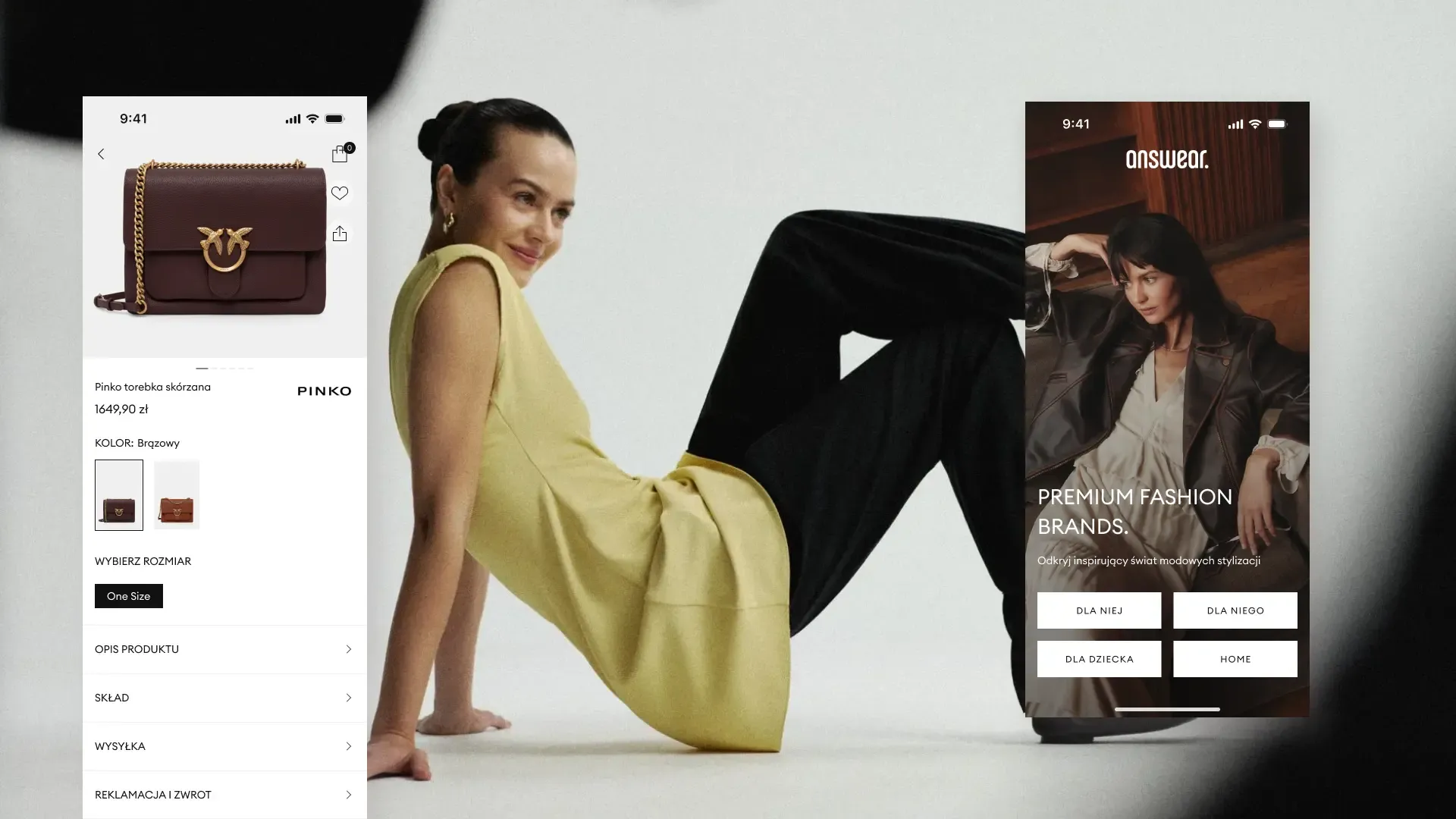
Answear.com is one of the strongest multi-brand e-commerce players in the European fashion market: 12 markets across Central and Eastern Europe, more than 200,000 products from 800 brands, and a strong position in the premium and limited-edition segments.
The sales model worked and the user base was stable. Even so, Answear asked itself about the next step: would the existing standard be enough if the ambition was to set new trends in the industry?
Simplicity that doesn’t give up on discovery
The answer was a comprehensive redesign of the iOS and Android mobile app, intended to turn it into an intelligent style assistant.
The task meant reconciling two goals that rarely go hand in hand. The first was shortening the user’s decision path so that shopping would be faster and simpler. The second was keeping room to discover new trends in an intuitive and engaging way. Striking a balance between the two required a considered design approach from the very start.
It started with the foundation
Delivering the project required collaboration between several specialised teams.
The Answear team led the design direction and key UX/UI decisions, setting the vision and the product’s development. To bring that vision to life, Answear brought in the mohi.to team to support UX/UI design, the Design System and the visual layer, and the Holdapp team to handle mobile development.
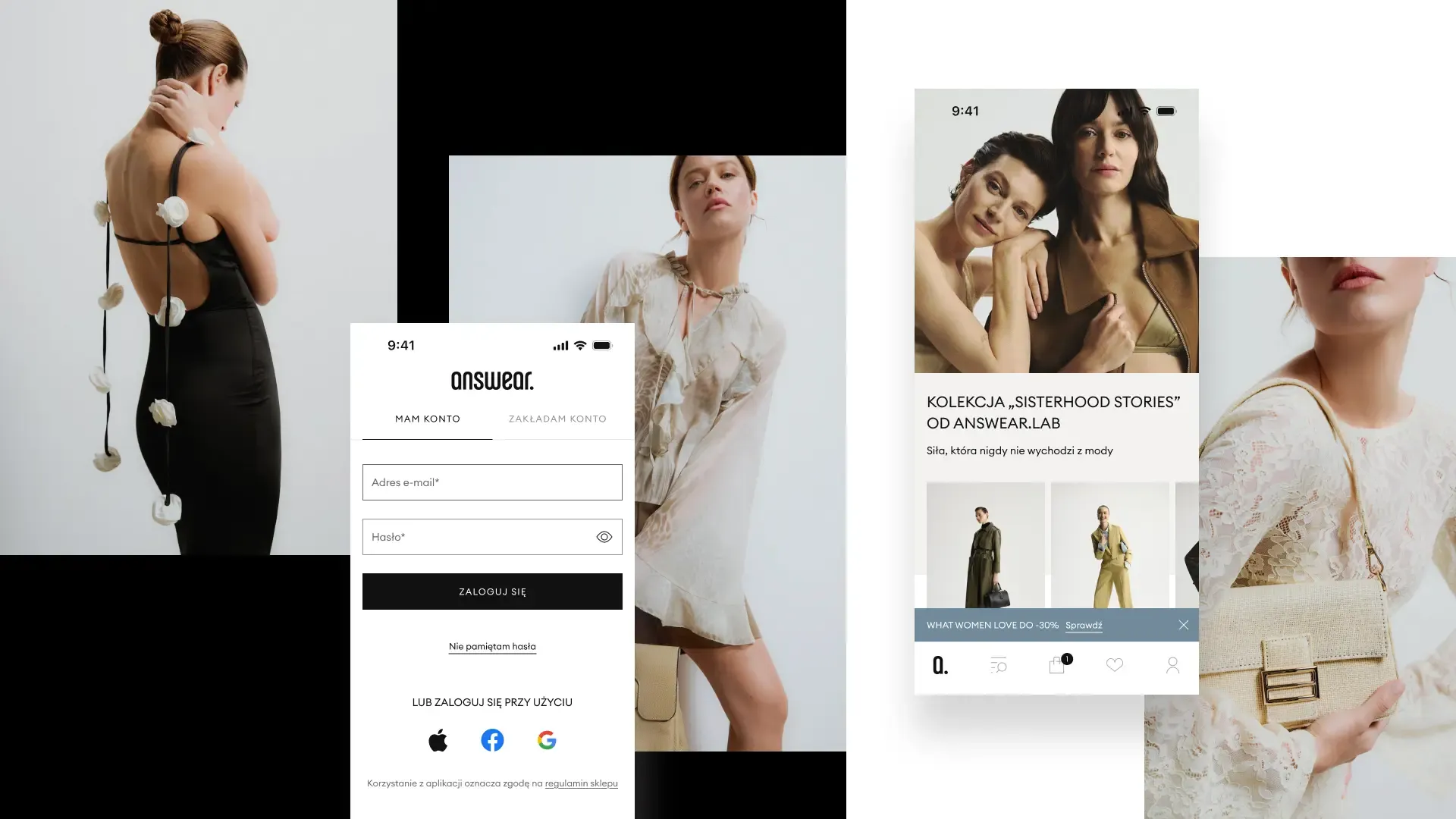
The starting point, however, was not a single app screen. It was a jointly developed foundation: a custom, minimalist visual language with Light and Dark Modes and a scalable Design System. This consistent component library for both platforms created the framework for the product’s further development and allowed subsequent teams to introduce changes faster and more consistently.
Inspiration and purchase in a single step
Instead of making isolated fixes, our team chose to design the core elements of the design system from scratch.
Building on this design system, the team created two key changes:
- A new checkout with a simplified purchase path that removes distractions and unnecessary steps, so transactions can be completed smoothly.
- A new product page with a new information layout that puts photos and key product details first, which significantly speeds up selection and purchase.
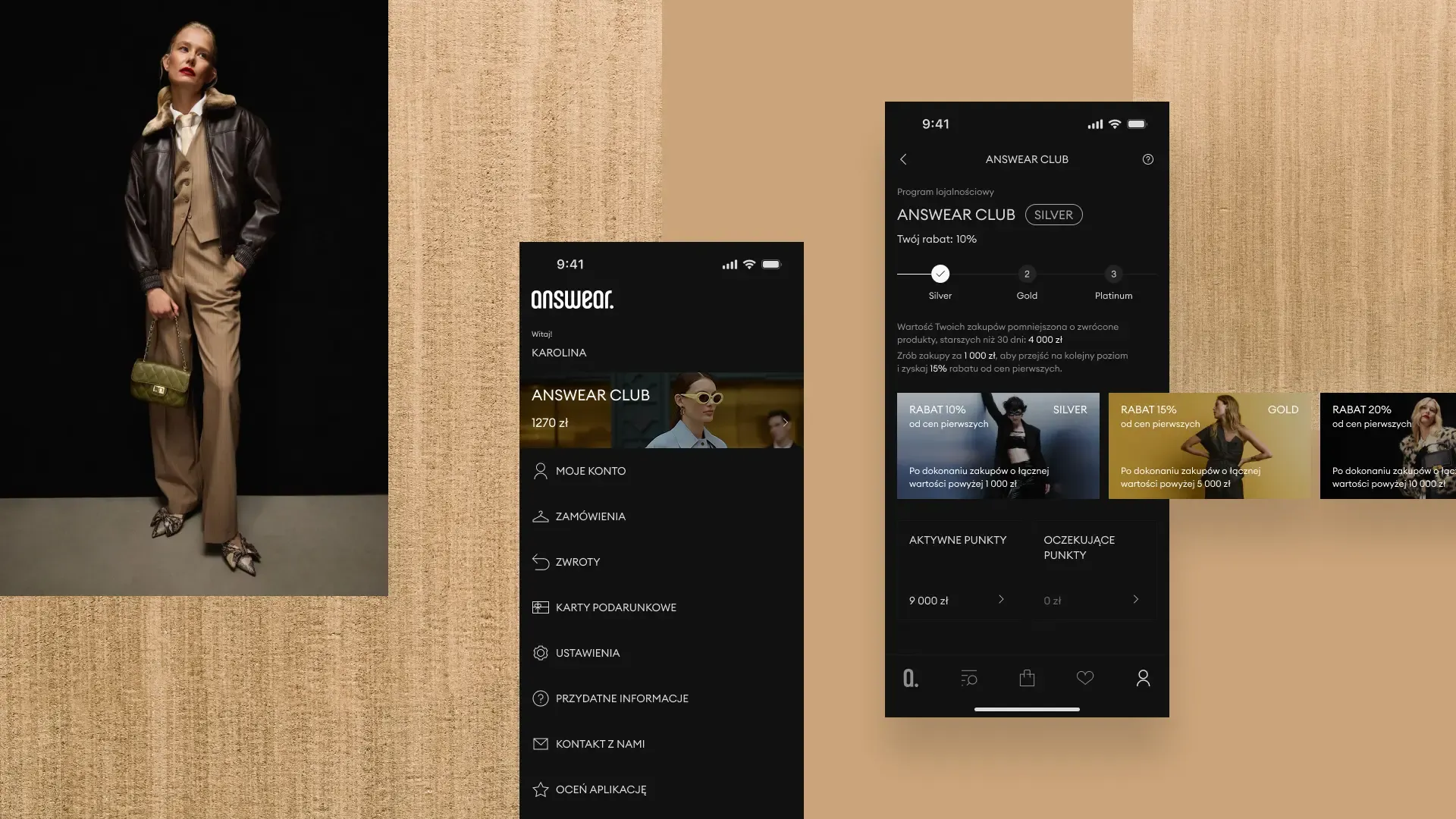
We also implemented a new typography system that reflects the brand’s character and ensures maximum readability on every mobile screen. A dedicated icon set, simple and visually consistent, makes navigating the app fully intuitive.
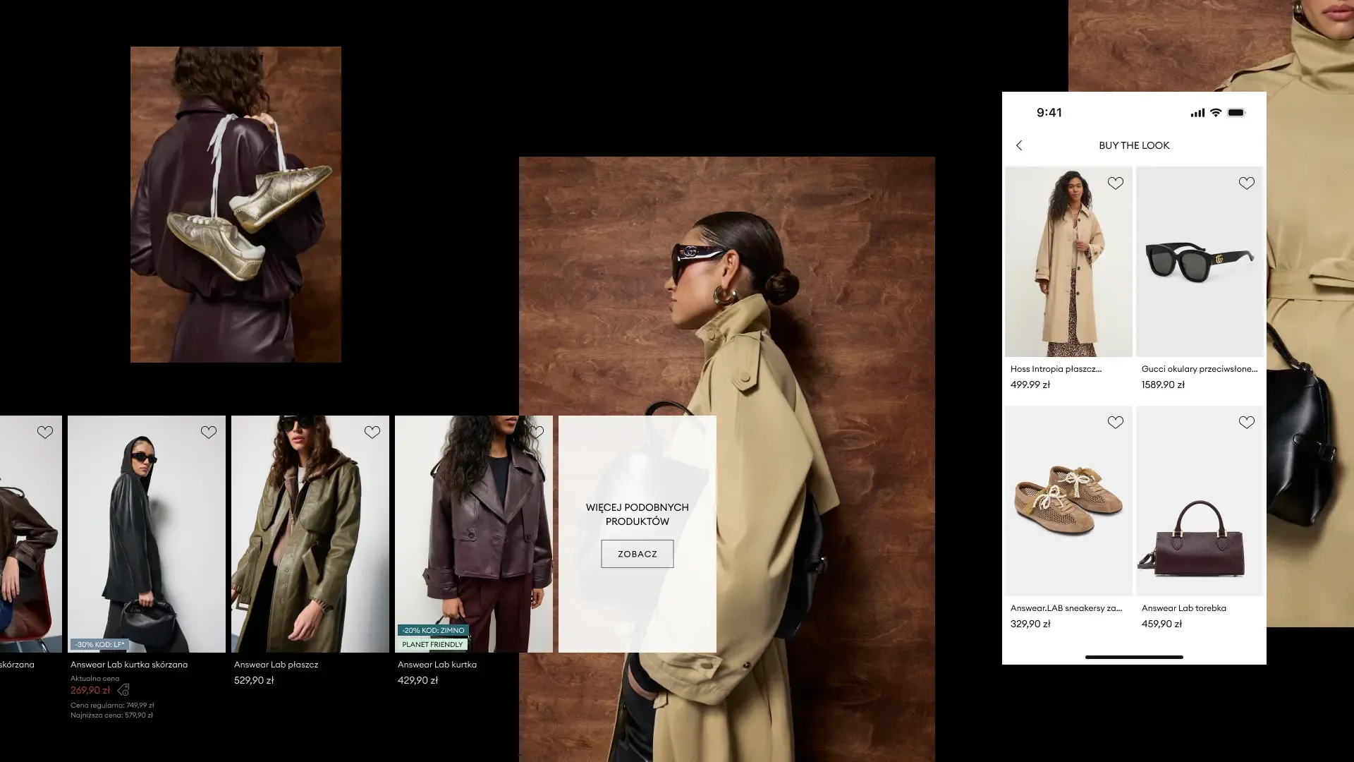
The balance between speed and exploration came from the “Buy the look” module. There, inspiration and transaction became a single step instead of two separate stages of the user journey.
Validation
The project went to market. The numbers that followed confirmed the chosen direction.
Revenue growth for Answear.com in 2025
App sessions every month
New installs every month
User rating on the App Store and Google Play across 12 markets
User ratings of 4.9/5 on the App Store and Google Play showed that the app not only sells faster but also builds lasting loyalty. Recognition also came from outside: an award for app development at the Mobile Trends Awards 2025.