Challenge
Going through a comprehensive rebranding and still bringing a couple of new collections to market can be quite the difficult undertaking. Luckily, the client was ready to undergo a complete identity overhaul and embrace a novel approach to designing and showcasing collections.
Solution
We knew that the project would not be easy and that many surprises awaited us down the line. From the very beginning, however, we were certain that in close collaboration with the client we will be able to create something truly unique. We began with an in-depth analysis of the prior efforts and accomplishments of the brand and its key competitors.
Who Is LARU
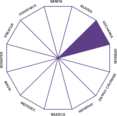
As we analyzed other high profile brands from the premium fashion industry we ultimately concluded that character of a brand is usually the keystone of its success. Product and promise should be linked with the brand’s personality. Strong brands develop personalities that allow it to stand apart from its competitors. Portraying the brand as a person that the client can enter into a conversation with enables us to build a consistent and well-considered communications style. At the same time, we determined that out of the twelve personality archetypes, LARU is, beyond a doubt, the Lover. This allowed us to imbue the brand with a decidedly female character, a key element for successful communication in the jewelry and fashion industries.
Previous Logo
From our very first encounter, we were absolutely sure that the logo would have the change. Its character was completely incompatible with the image that the client wanted the brand to project. LARU was founded by young entrepreneurs with a deep passion for making modern jewelry.
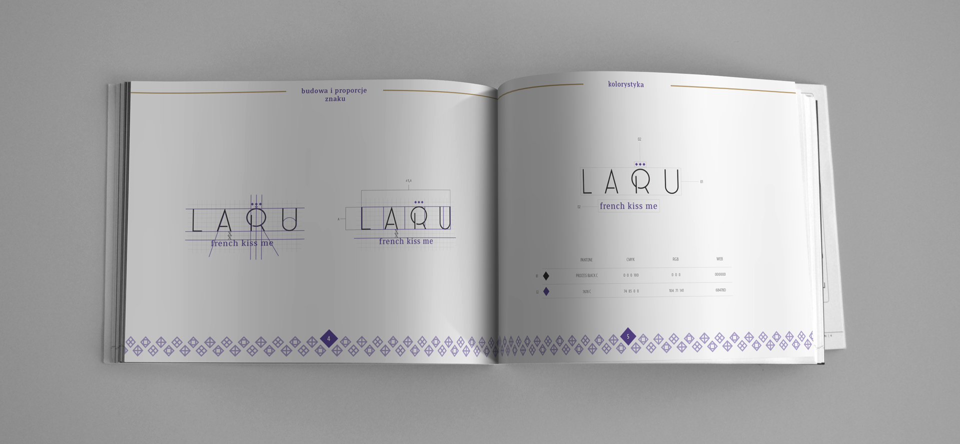
Unique Logo for a Unique Brand
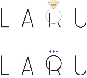
As we sought a new logo that would be consistent with the principles laid out in the new strategy, we tested a lot of potential solutions. We chose to focus only on the simple, elegant ideas but ones imbued with an idea. The logo we ended up selecting and refining is based on subtle typography designed from the ground up. A circle symbolizing a ring is inscribed in the letter R, with plain squares superimposed on top, representing simplified gemstones. The three stones represent the client’s vision for designing the collections—always based on three different models and three different precious stones.
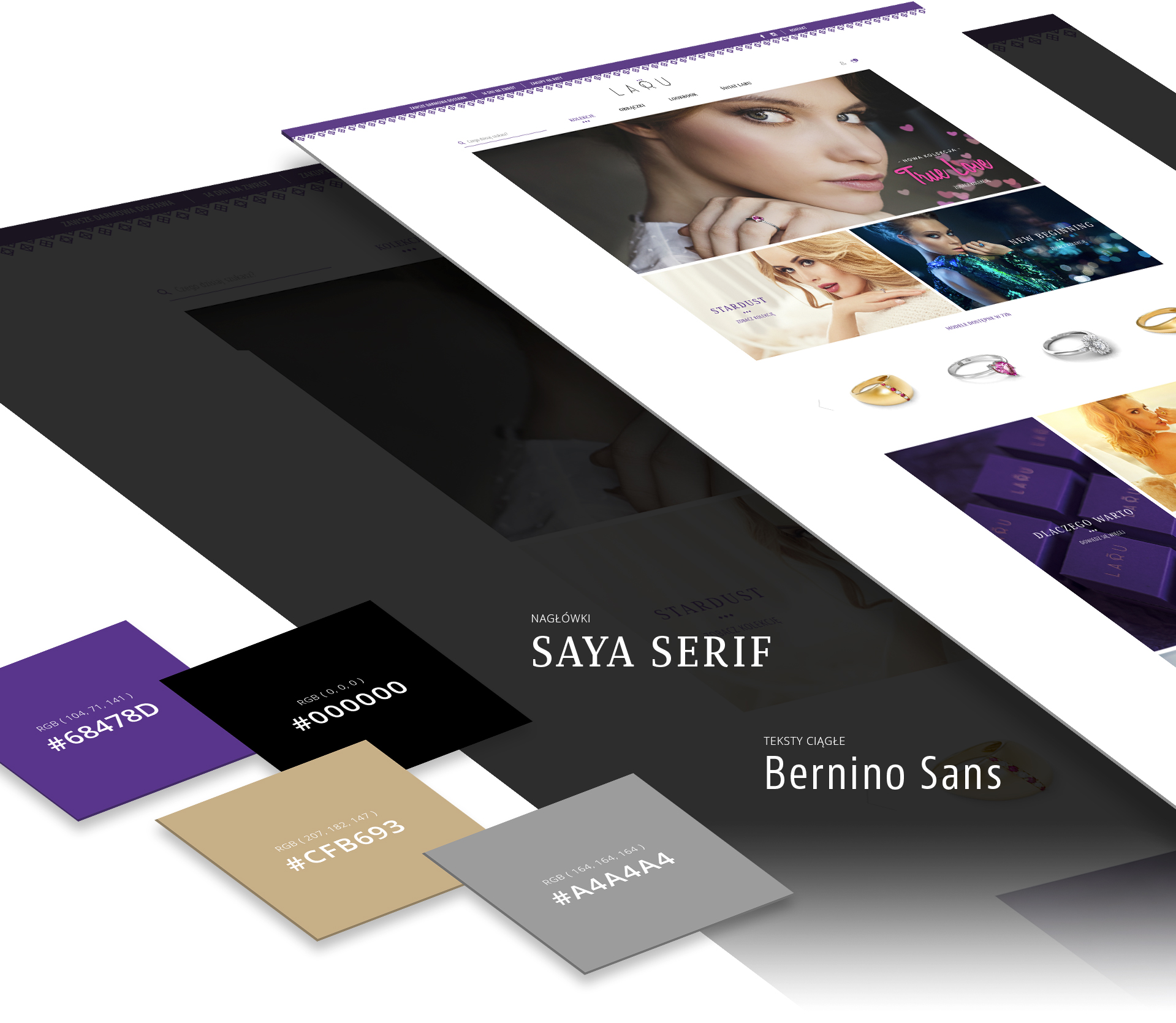
Graphic Design
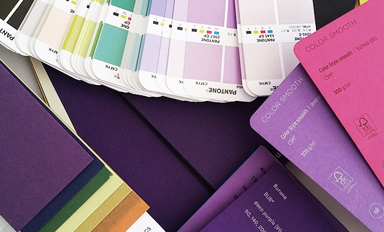
Already at the logo design stage we were nearly certain that a shade of purple will be selected as the brand color. In this particular case, we were inspired by the color of amethyst which enthralled us already during our first meeting. Purple is a sensual, female color, and highly original. The final decision as to the shade of purple we would settle on was still far away. We tested different variants and browsed color guides for hours on end.
The following stage also presented us with another considerable challenge—the proper selection of materials for prints, stationery, and packaging. Alongside these developments, we were also busy designing the brand’s key visual. We needed to find the perfect typeface that would work equally work on paper and on screen. We also designed a pattern built around three symbols inspired by different cuts used for gemstones.
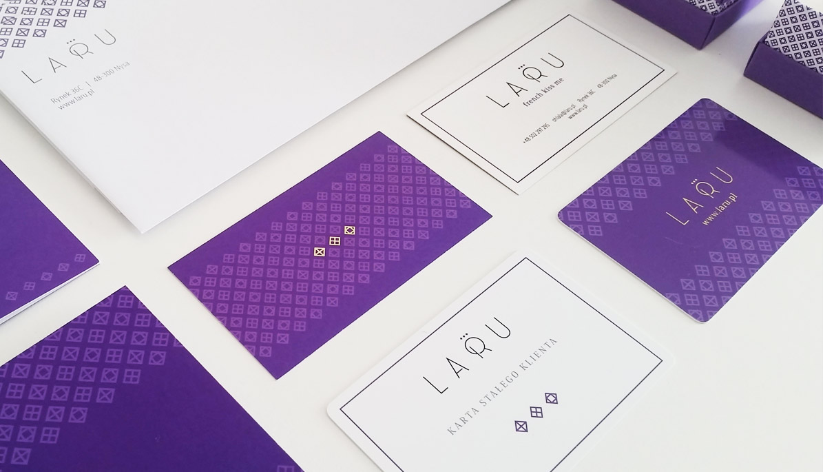
Unique Printed Materials
With the foundation for the key visual laid down, we were able to begin design work on a range of printed materials and accessories for the brand—stationery, business cards, envelopes, and a custom stamp. The calling cards were additionally adorned with hot-stamped gilding.
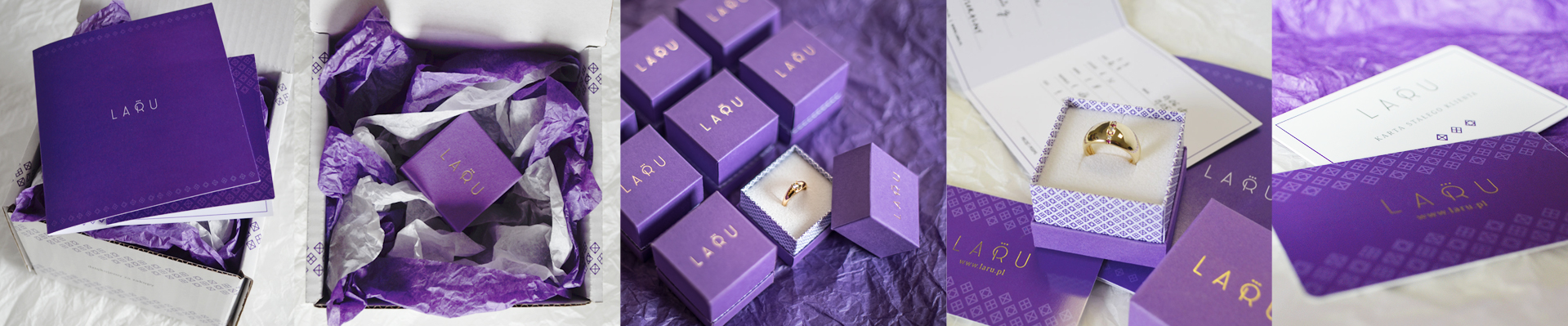
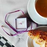
Unboxing—Packaging Matters
The wait for the purchased products should be capped with a creative and unique unboxing experience. We’ve made every effort to make the unboxing appropriately brief but very pleasant. The order is shipped in a branded cardboard box that not only secures the product but also immediately informs the customer of their right to refuse damaged goods. The box is sealed with a branded sticker. After opening the box, the client sees a thank-you card carrying a certificate and a loyalty card. The interior of the box is lined with two-toned tissue paper that snuggles the jewelry box and secures it in place. The ring box was custom designed and decorated with hot-stamped gilding. The unboxing experience was designed to make the customer feel pampered and cared for, with the creative packaging intended to elicit a Christmas morning-like emotional reaction.
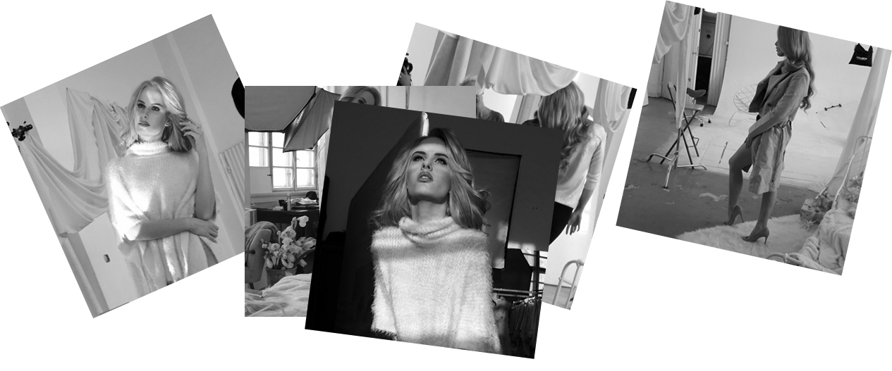
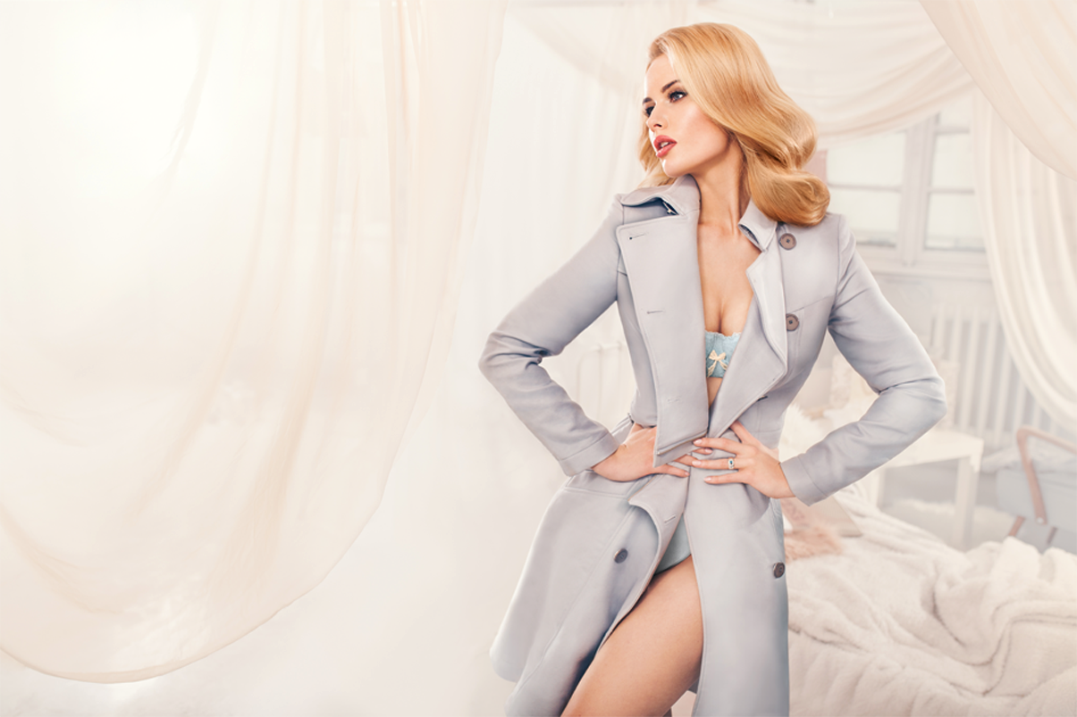
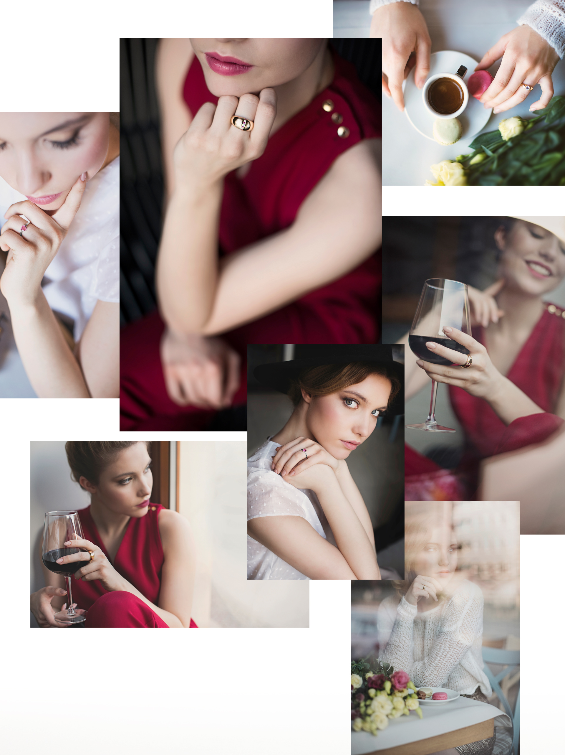
Capturing the Essence
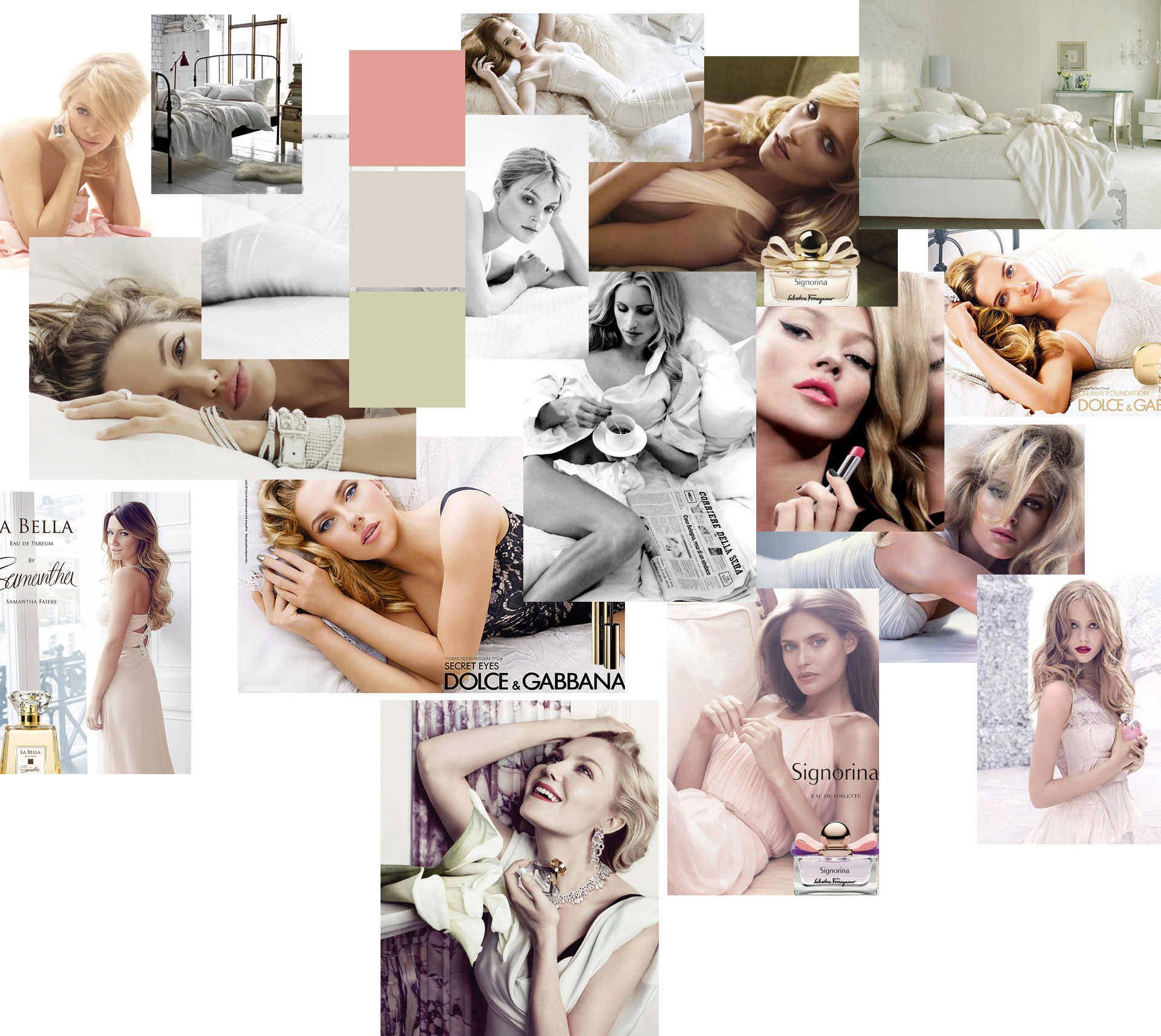
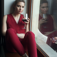
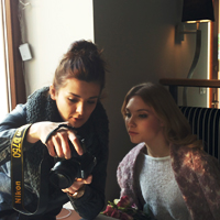
Photographing jewelry is a very peculiar task. In contrast to run-of-the-mill fashion shoots, the photographer needs to be able to skillfully photograph rather minuscule objects, in this particular case—a LARU ring. After discussing the matter with the client, we decided to use the photography to flesh out and emphasize the character of the brand. Before each photoshoot, we drew up moodboards, suggested the model roster, and debated the potential directions we should be exploring artistically. Shown below is one of the moodboards developed for the Startdust collection.
New beginning
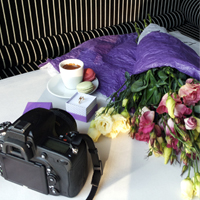
The launch of the first post-rebranding collection was a remarkable event. The collection comprised three rings fitted with large stones sporting distinctive cuts. The models were selected to match both stone and styling. We ultimately shot three separate mini-sessions, each one dedicated to highlighting one of the stones used in the collection.
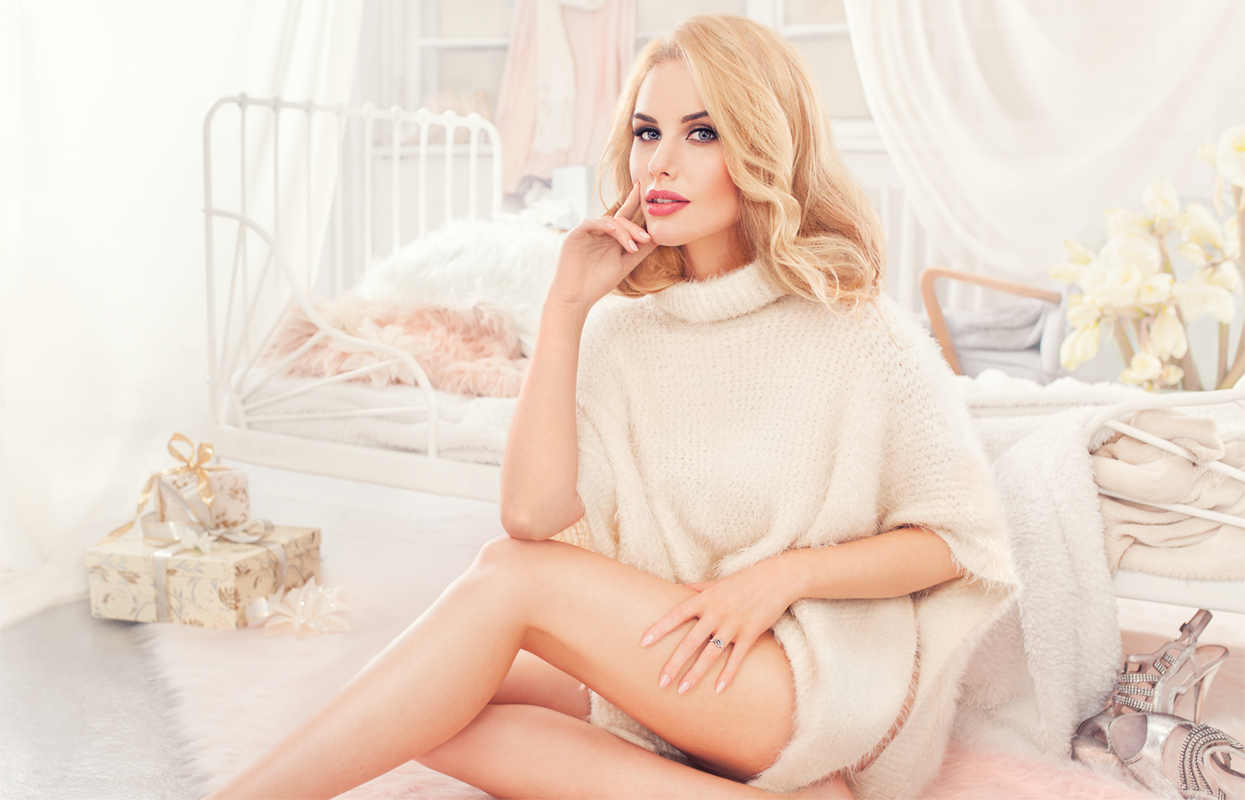
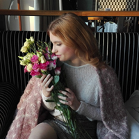
Stardust
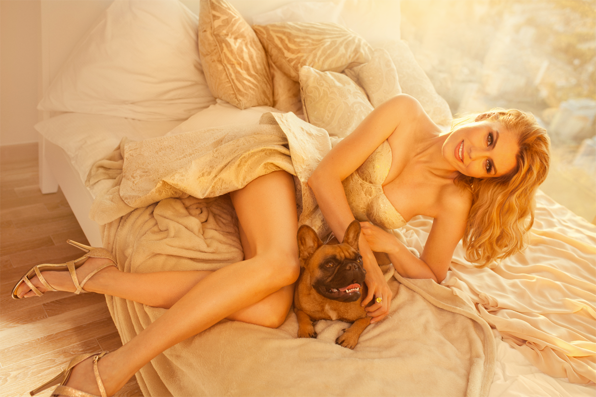
The follow-up collection was launched in the winter. The rings were inspired by the aura of the winter season, including the texture of a single snowflake. Although winter lay at the heart of the collection, we decided to photograph it in warm, cozy interiors.
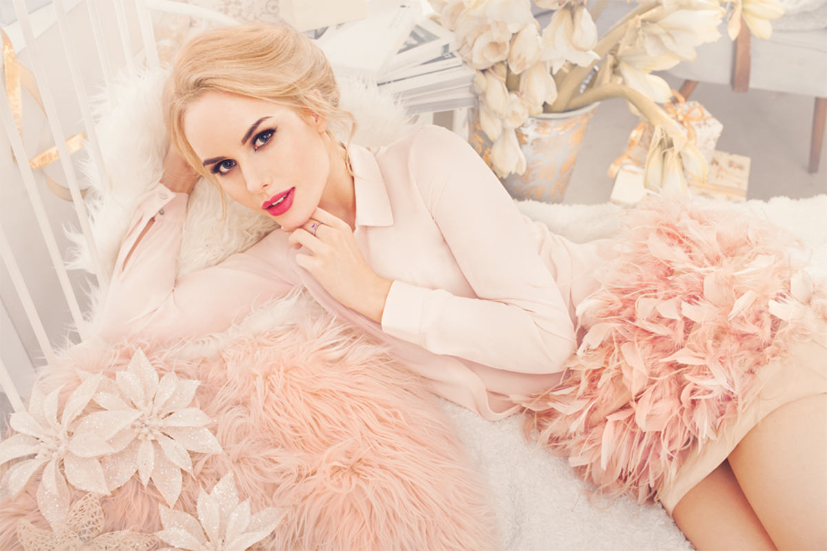
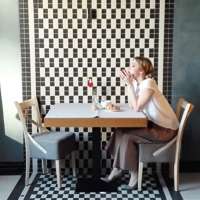
True love
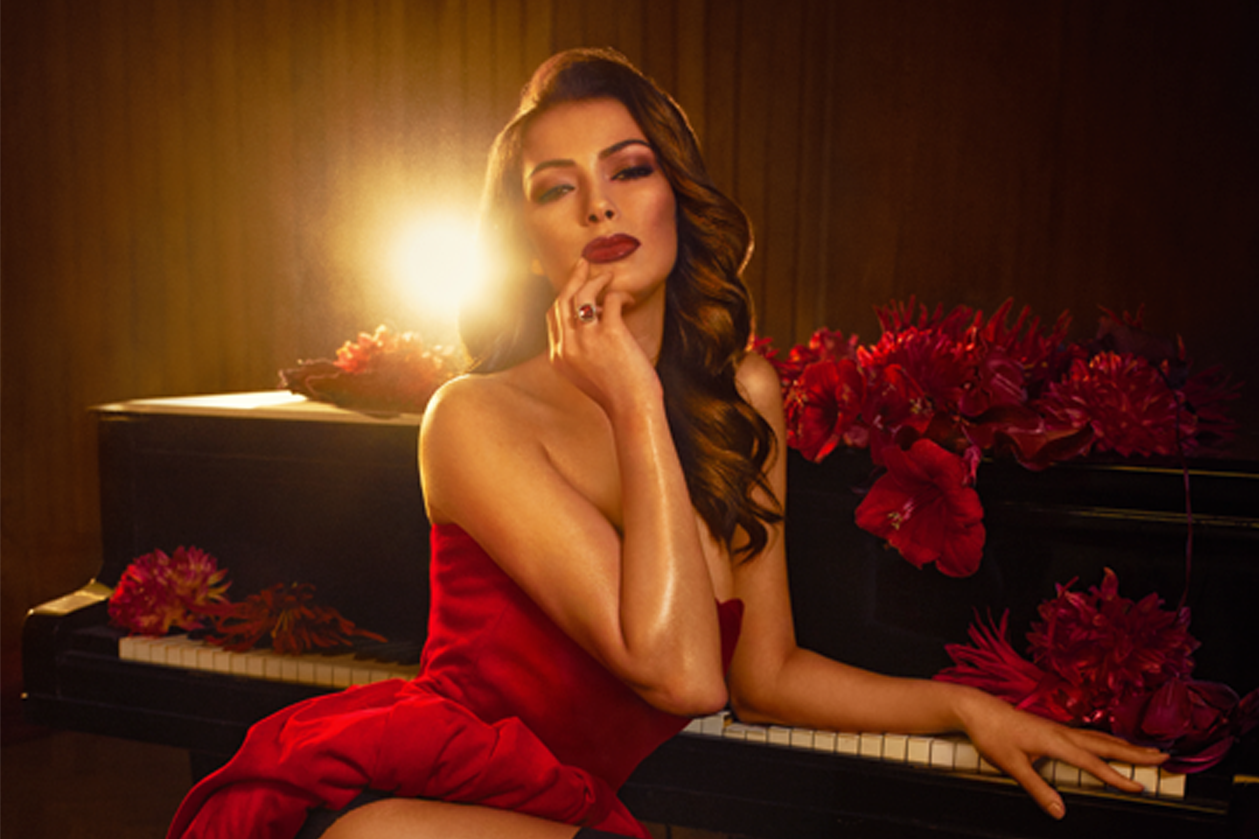
The idea of shooting a French café-themed session for LARU was conceived early in our relationship. When the brand moved to launch a Valentine’s Day collection, we decided that our café concept would fit it perfectly. The interiors of the French restaurant La Folie served us as the backdrop for three different scenarios—three different Valentine’s Day dates.
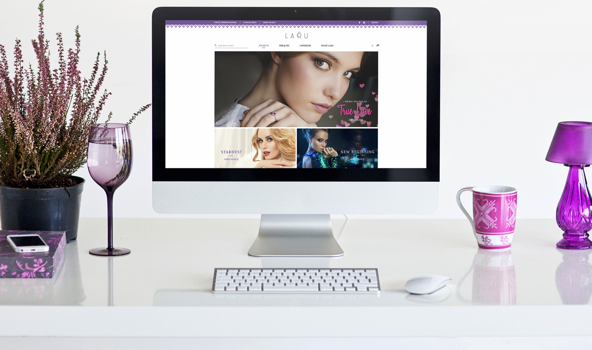
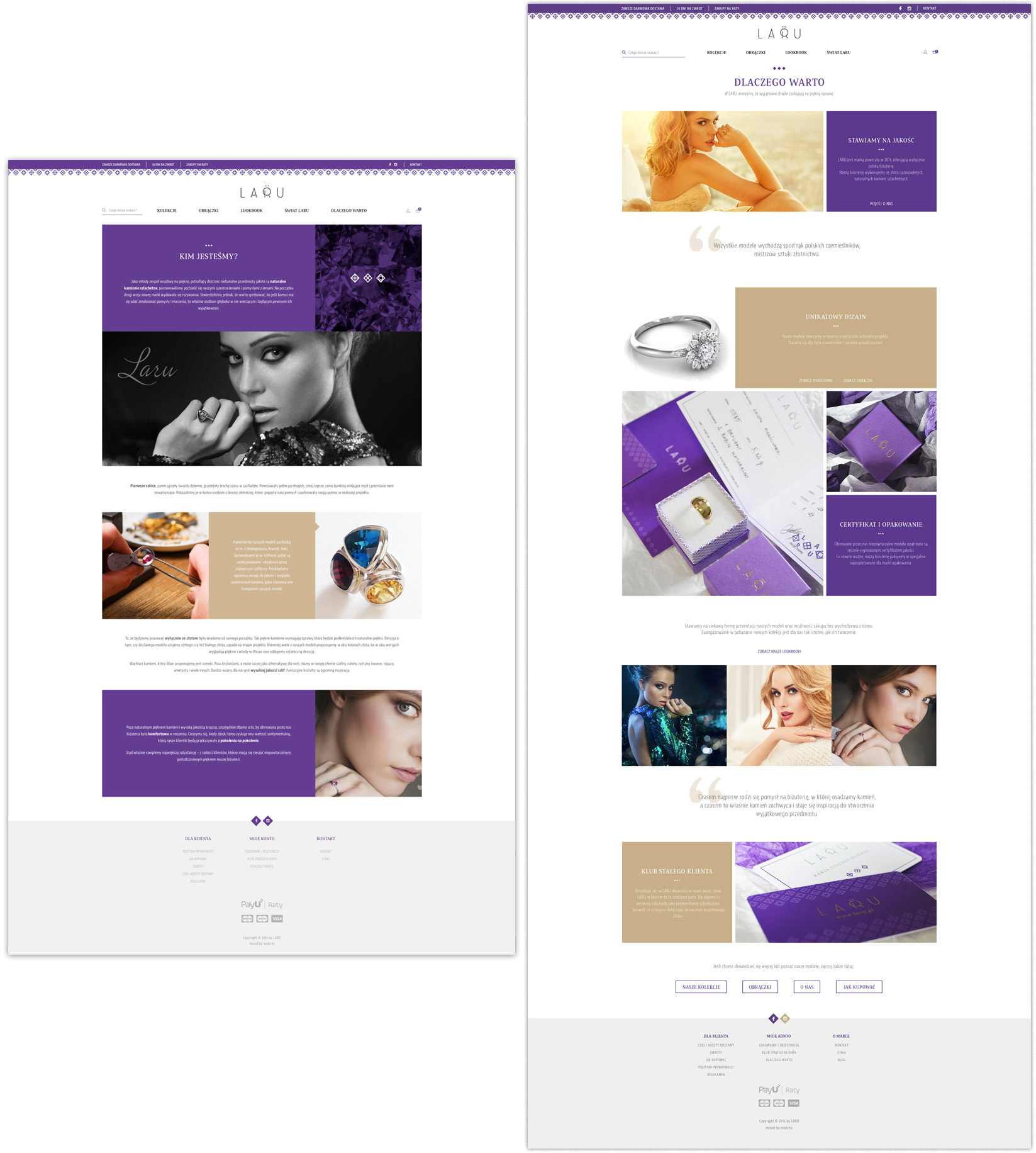
The Perfect Website for a Lover Brand
When dealing with a brand that sells nearly exclusively online, a website usually has to double as a viable e-commerce platform and an effective sales funnel. We were most interested, however, in having the website reflect the key characteristics of the brand itself, allowing consumers to easily identify with it. We planned to accomplish it using pictures from our photoshoots and a tone of voice outlined in the strategic guidelines. We also added subpages dedicated to collection lookbooks and a blog to support brand communications.
Usability Is Key
in E-Commerce
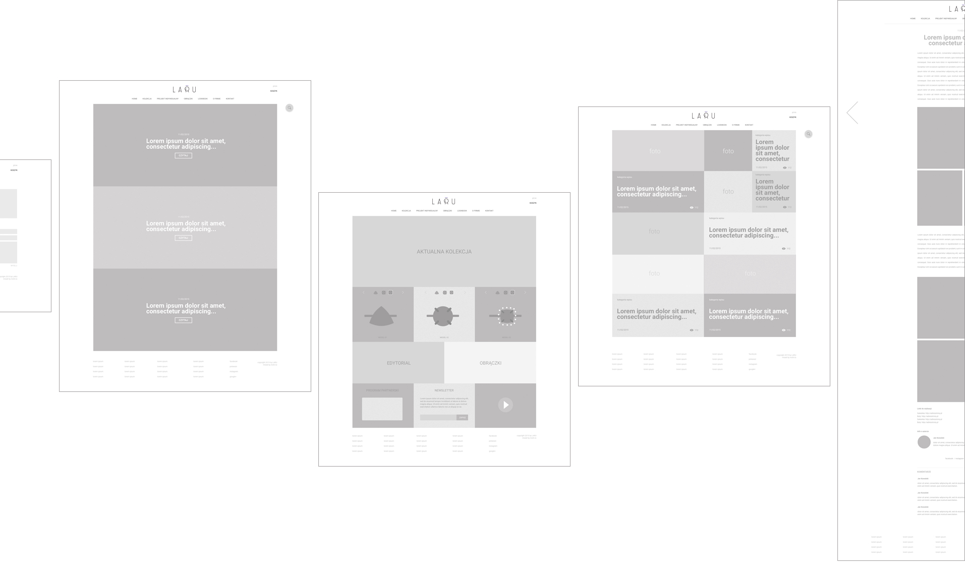
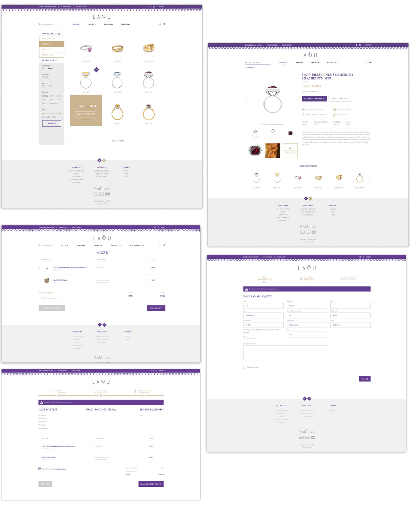
Although an online store should be well-designed and pleasant looking, its main goal is to sell. That’s why the solutions slated for implementation should be thoroughly vetted already at the UX design stage. The design we ultimately ended up implementing was slightly different from our initial functional mockups. In the course of graphic design work and implementation, some of the features were expanded but the basic design assumption remained the same.
Making Shopping Enjoyable
The ultimate decision to make a purchase is driven by many smaller details. As the customer approaches a purchase, in no way should they feel disoriented, underinformed, or frustrated. That’s why have made every effort to make category subpages and product pages as intuitive and informative as possible. Later on in the purchase process, it’s crucial for the client to know where they’re headed and clearly see the most important aspects of their order.
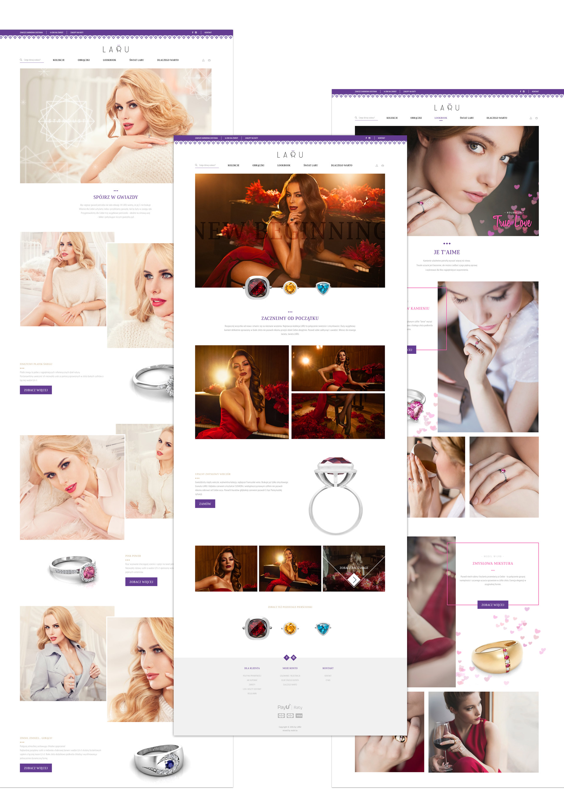
Lookbooks
Our photo shoots produced many stunning pictures that we wanted to spotlight on the website. So, we decided to create a dedicated subpage that would feature the lookbooks for all individual collections, to give potential customers better insight into the brand’s vision for their products and collections.
Why Choose LARU?
LARU is more than just strikingly beautiful, unique products—it’s also a company made up of highly motivated, passionate individuals, driven by singular vision. The brand website couldn’t simply leave all of that out. So we decided to add a dedicated “About Us” site that outlined the brand’s vision and mission, and a “Why Choose LARU” subpage that describes, in detail, the many benefits of shopping with LARU.
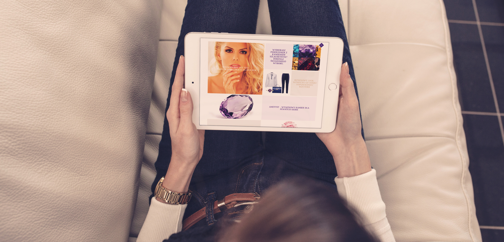
The LARU Universe
As we drew up a strategy for the brand, we also constructed a specific image of the idealized LARU woman. Aside from trying to portray her during our photoshoots and later in the lookbook section of the website, we needed a separate space where would gradually reveal her world. And a blog is a perfect vehicle for such an effort. In the process of drafting the first posts that would be published on the blog, we also considered what sort of content the brand’s prospective customers might be interested in—information about jewelry in general and LARU products in particular.
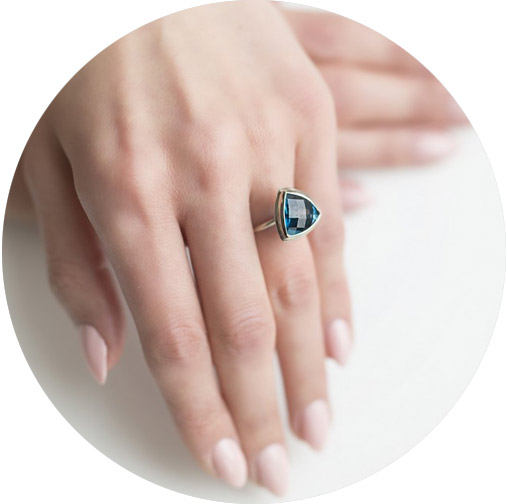
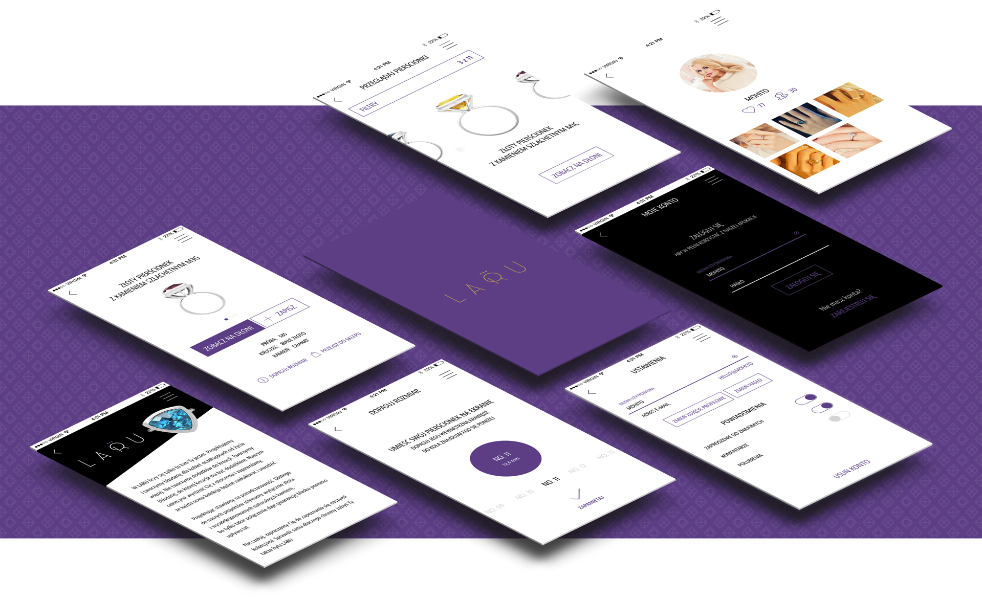
Virtual Ring Try-On App
LARU deals exclusively in unique rings. Early in the relationship, our LARU partners informed us that the question of customers misjudging the size of the ring they needed and eventually returning products was a pain point in the company’s operations.
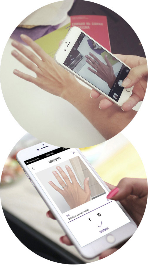
Problem
For major jewelry brands, on-line retail usually plays second fiddle to networks of traditional brick-and-mortar outlets. This allows their customers to pick rings online but try them on for size in a real-world location. To put LARU on equal footing, we sought a solution that would allow its customers to bypass having to visit the store. One idea included a genuine ring sizer that a customer could order for free in the online store. That solution, however, had numerous downsides, including having to place an order and wait for it to arrive. Plus, it wasn’t able to reflect the size of the stones in the final products. So we pressed on in our search of something better.
Solution
We ultimately decided that a dedicated mobile app would work best in this particular case. The app allows the user to:
- 1. 1. measure the size of their finger by placing a ring they currently wear against the smartphone screen;
- 2. evaluate the look and proportions of the ring by taking a picture and overlaying it with an appropriately scaled model of the ring.
The app was supposed to serve as a useful tool that allowed potential customers to better evaluate the product before making an online purchase.
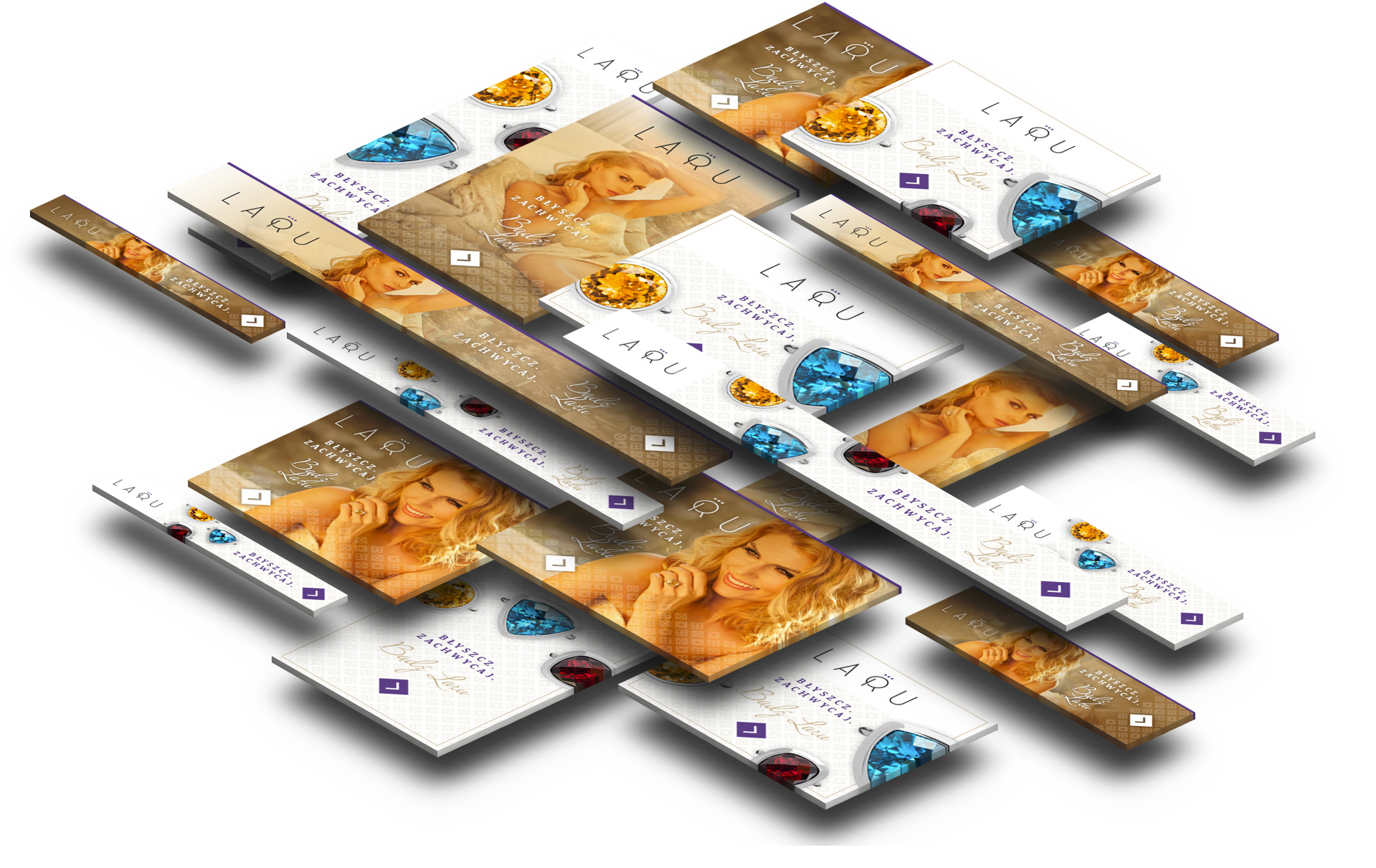
Social Media Efforts
In the contemporary media landscape, it’s quite difficult to run a successful business based only on online sales without committing to a considerable promotional effort on social media. Social media channels offer us a range of means to reach new clients and target audiences. An appealing social media presence, backed by targeted advertising efforts, can bring quick effects.
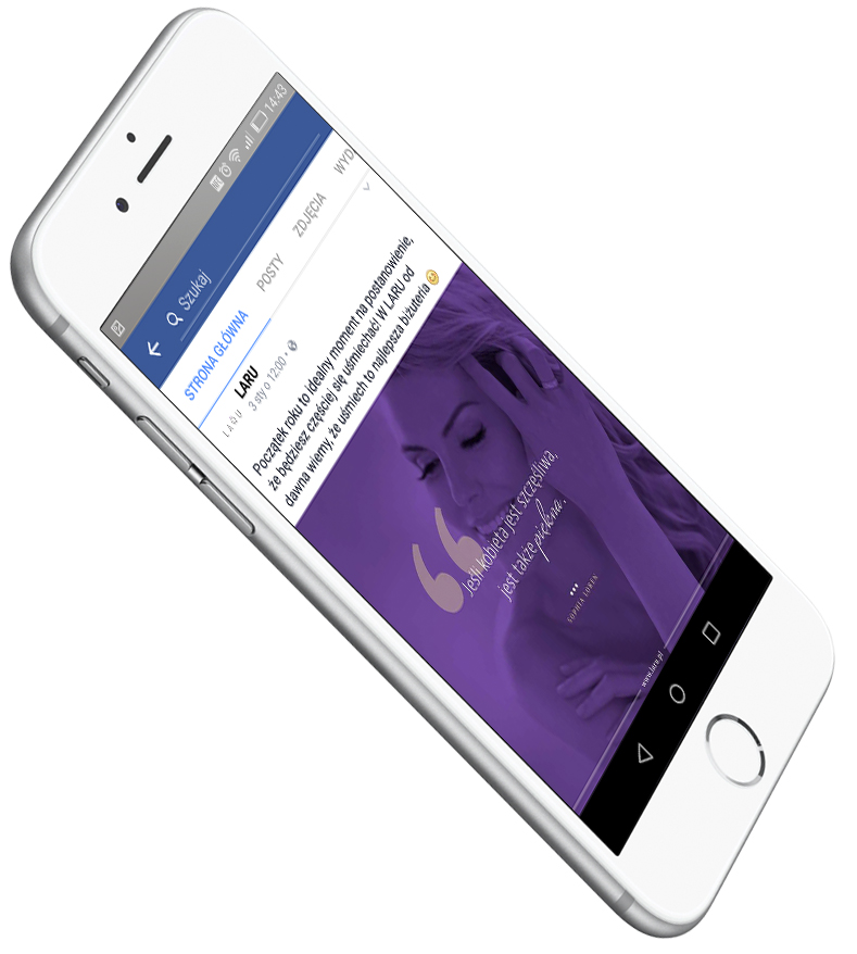
In the early stages of our social media efforts, we tidied up the brand’s Facebook profile, then implemented a comprehensive communications strategy for the platform. We developed long-term objectives and drew up monthly editorial plans. Then we gradually developed content and visuals to service these plans.
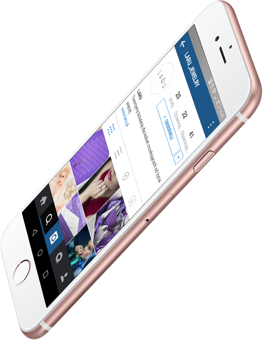
Instagram was selected as an important social media communications channel. In this case, we used a similar approach to the one adopted for Facebook—first, we drew up a monthly editorial plan and then got to producing content to serve it. The brand had no Instagram presence before we came along, so it also fell to us to launch the account and produce initial results.
Summary
After a year of very intensive efforts, we can safely say that the rebranding was a spectacular success for us and a huge step forward for the brand. Thanks to our comprehensive collaboration, the brand was able to expand and grow its customer acquisition rates.
Are you planning a new project?
Do you have questions?
Write to us
